The Avett Brothers are a band that blends folk, indie, and rock and roll. As of this writing, I've worked for them once in late 2014 to create a matching set of Halloween and Fall-themed posters printed on plastic and metallic foil, respectively. This time around, I had full creative control and was tasked with crafting a poster to promote the band's spring 2015 stop in Tallahassee, Florida.
Concept
Didn't want to just repeat myself, so I dove in the band's music and and observed some of their recent performances on Youtube to get a feel for how to differentiate this poster from the last.
The Avett Brothers' sound encompasses many styles, many of which derive from the idea of Americana. I hear shades of folk and outlaw country in their music, so I gave the skeleton a cowboy hat and banjo.
After an embarrassing amount of time spent brainstorming, sketching, and hitting my head against the wall, I decided to mash-up English illustrator Edmund Sullivan's black-and-white drawings with the framework of "The Spirit of Art Nouveau," Alphonse Mucha's Zodiac print. It felt fitting since some of the most iconic of the original posters promoting The Dead (particularly the iconic Fillmore posters commissioned by Bill Graham) directly appropriated imagery in a cut-and-paste fashion.
Sullivan's rose-picking skeleton from The Rubaiyat of Omar Khayyam laced with psychedelia-inspired type and graphic design sensibility by Alton Kelley is a good example of this. This approach felt weirdly appropriate because I knew that the surviving members of The Dead would (as of this writing in April of 2015,) be getting back together for a run of shows. The two aren't performing together but I wanted to imply some synergy between that fundamental band's artistic roots and The Avett Brothers' own folk-influenced rock vibe.
Ideation + Collage
Before settling on this direction, I did a lot of little sketches and thumbnails to see if anything would stick. I eventually decided against something entirely original because I wanted the aforementioned thought process to be apparent to anyone who knew the creative history behind the classic gigposters of The Dead. I could have done something entirely from the ground up, but I'd already done that with the previous Avett Brothers' Halloween set, and I was consciously trying to do something different while working smarter instead of harder.
I still took time to let other ideas germinate and almost went with a direction referencing their Outlaw Country side, as their live sound has more of that edge to it.
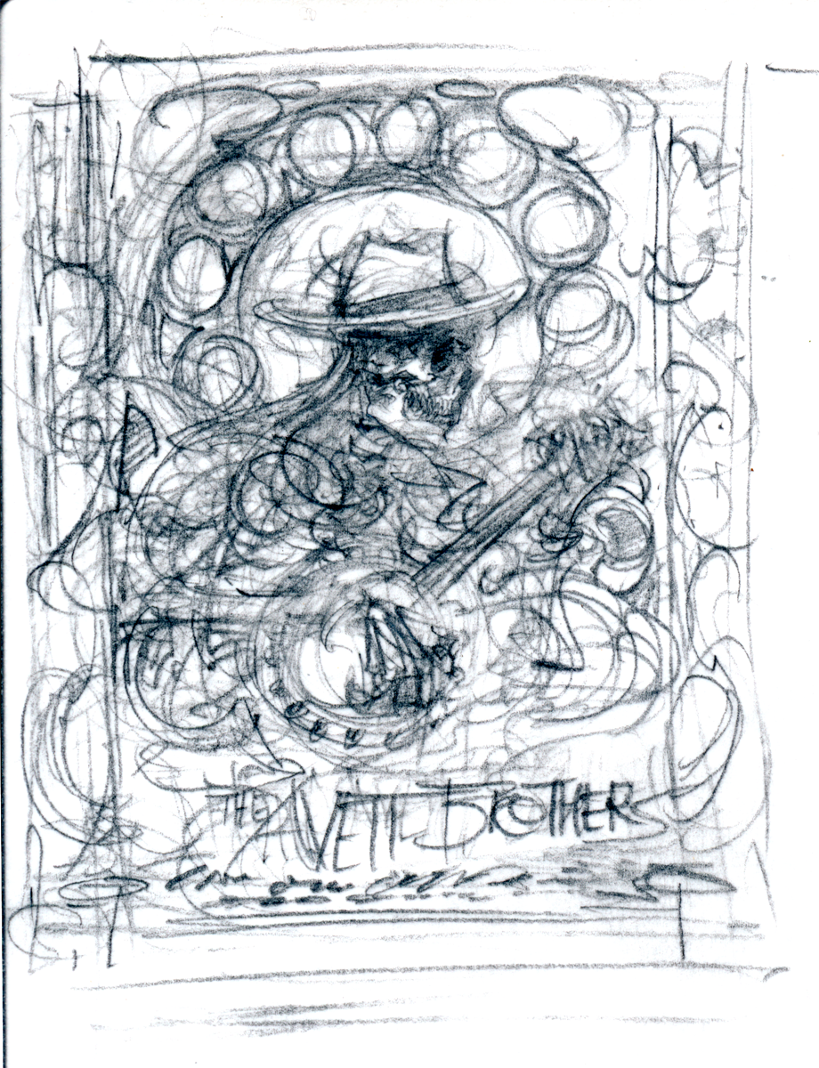
Extremely rough thumbnail combining the Sullivan skeleton with the Mucha frame and The Avett Brothers' symbols.
The extremely rough sketch was enlarged and used as a skeleton for a photographic collage.
Final shot of the rough collage composite which would be re-drawn later. Type treatment eventually got switched up as well. I eventually also did away with the clothes in order to make the figure more androgynous and demographically-open.
Linear Drawing
Once the collage was done, I printed it out onto 11"x14" paper and began re-drawing the image in my own style on equally-sized Strathmore sketch paper.
The drawing took several days to render out completely, and I took some liberties with the details in the composition to keep myself interested. I also recall being bored of the band's name placement, as I've noticed a tendency to slap it on as an afterthought within the footer. Instead of that, I filled the bottom of the image with a bubbling Florida bayou.
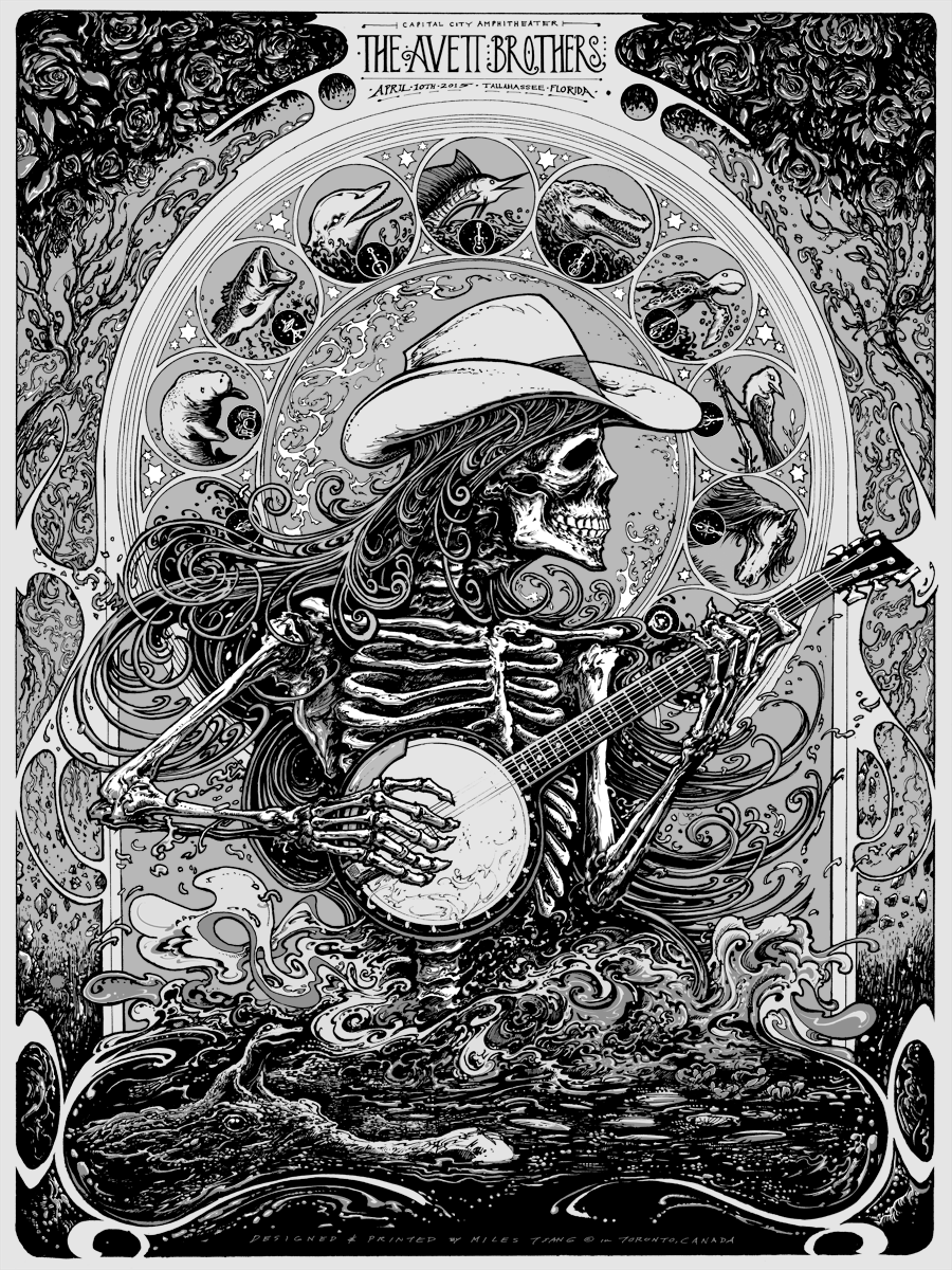
Finalized scan of the key drawing without midtones added. I used Rapidographs and brushed out little mistakes with white gouache to retain sharpness. I did not use clayboard for this illustration because I wanted to switch it up. Pen on paper are a little less forgiving than clayboard.
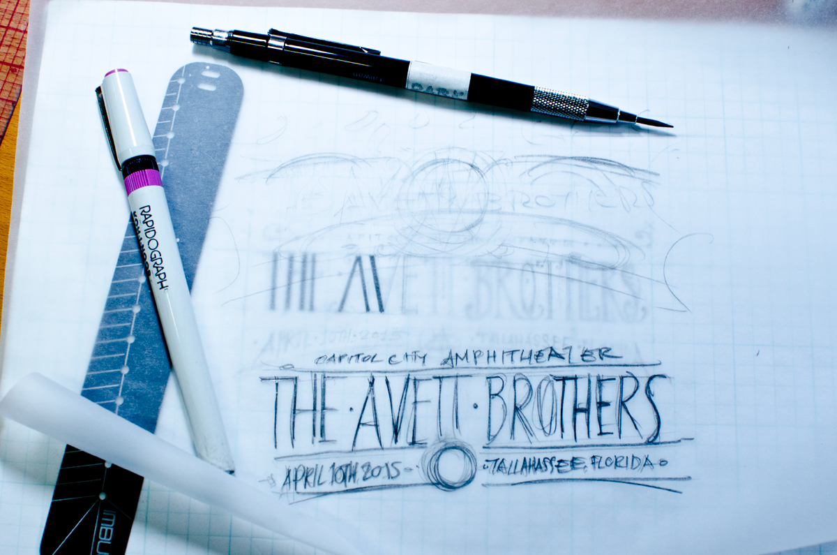
Workspace with equipment and junk splayed everywhere. Trying to figure out the typography.
Finagling.
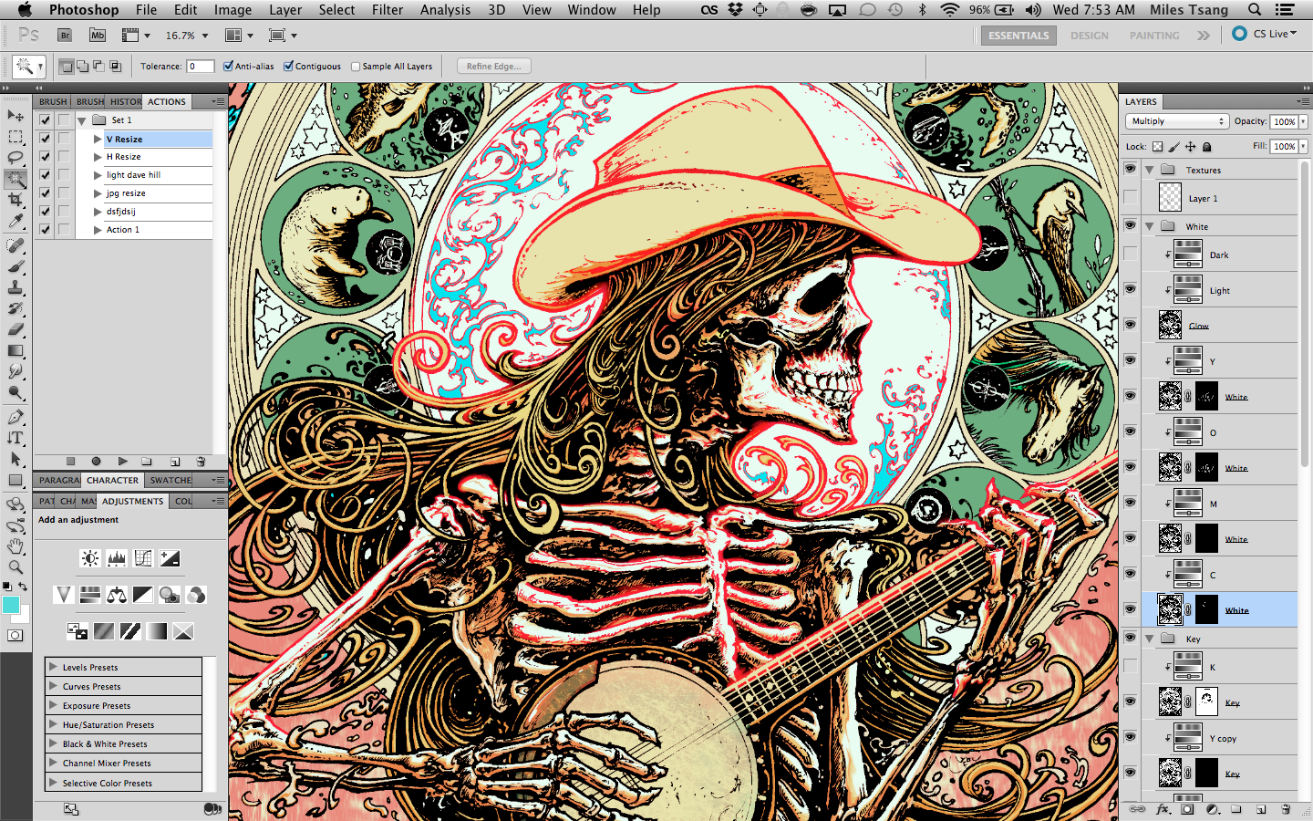
The band's name and gig info was added to the top section along with Florida's state animals replacing the ones in the original Mucha Zodiac. Then the key linework was rounded out with midtones which were painted in digitally. Normally I just plough through the grey haphazardly with a chunky Faber Castell grey marker and scratch away to sharpen the shapes, but doing the midtones digitally was faster with the tight key layer.
Final Illustration
Once the final greyscale image was solidified, the time came to colour.
I generated the 'flats,' myself and then used Channels to save selected areas in which to apply different levels of chroma.
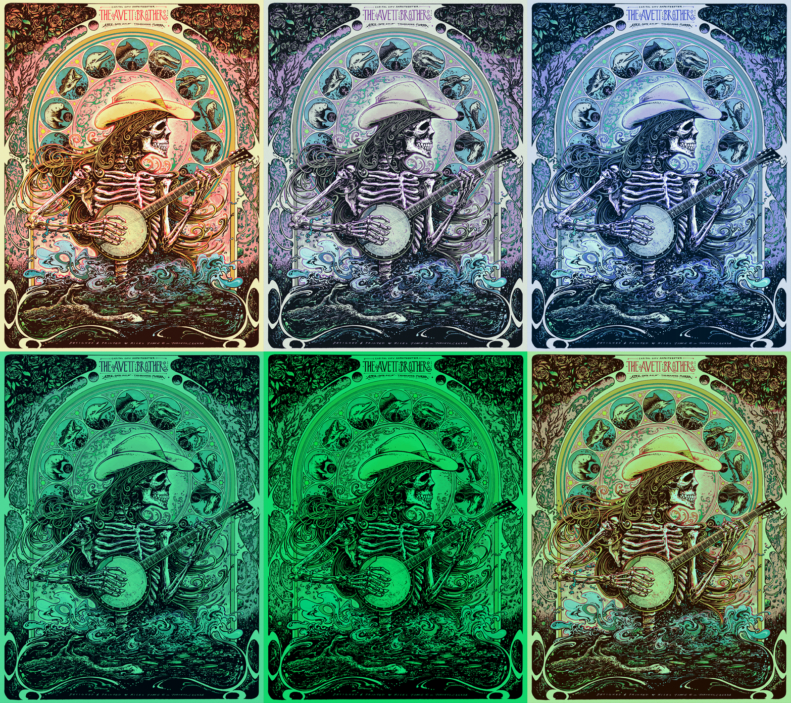
I knew the regular show edition needed to feel warm (since the show is in Tallahassee, Florida in the spring), so I worked up and down from a red-pink base once the aforementioned colouring legwork was done.
Articulating specific areas, trying to balance the colour scheme of the original Mucha Zodiac against my own tendencies and the needs put forth by the scene in the print. After a certain point, I just began improvising.
Final glow-in-the-dark image.
Final alternate colour way "Cobalt Keys." (referencing one of Florida's most famous locales)
Final regular show edition "Sunshine State." (as in being of a sunny disposition or a reference to the official nickname of Florida)
Screen-Printing
Prepping one of the layers to print using a trusty vertical exposure unit and a bunch of rubber tubing. Prepping is always the worst part of printing...
First layer laid down. I've learned to separate using dropout (30-50% tone laid beneath the eventual key layer) rather than flat trapping because it gives off a more pleasing array of colours with some slight transparency. It also covers up dry spots in the key later on, making the print look textured rather than misprinted.
First colour down on the Cobalt Key colourway.
Fast-forwarding a few layers..
Sunshine state pre-key.
For the last few prints I've done, I've tended to go with CMYK-style separation and this print is no different. I wasn't as stressed for time, so I switched things up a littleby also printing an intermediate orange layer to give the warm's more body.
Mixing key colours.
Resting piles of almost-finished prints.
Intermediate green layer for the Cobalt colourway.
Reclaiming the screen after the ink is printed.
Posters drying.
The final equalizing glow layer, deployed as a final glaze/special effect.
Good colours, tight registration, eye-catching image. Success!
After all of the posters were given a day to dry in the racks, they were piled onto one another and tightly pressed so they would be very flat. This makes trimming and signing and numbering a little bit easier since inconsistencies in the body of the poster go away and the edges do not curl.
Trimming the poster in an electric card-cutter (just big enough for 18"x24" posters).
Final poster stacks.
Leftover trimmings.
Prints being laid out for signing and numbering.
Details
This Avett Brothers gig poster will be available for purchase through The Shop. Please sign up for the newsletter at the foot of this page and follow me on Facebook or Twitter for updates on the day my copies are released for the public to purchase online. Thank you so much for reading!
*EDIT* This poster is now sold out.
