"'Punk rock' is a word used by dilettantes
and heartless manipulators
about music that takes up the energies,
the bodies, the hearts, the souls, the time
and the minds of young men
who give what they have to it
And give everything they have to it."
-Iggy Pop
Iggy Pop is a multi-faceted American icon whose talents include acting, musicianship, performance, and songwriting. He has led a storied life as a solo artist from the mid-70's onward, and is the vocalist for The Stooges, who are one of the most influential rock bands of all time. Contemporaneous with other groups like The Clash, Ramones, and Sex Pistols, Pop and his cohorts ushered in an early incarnation of the punk rock sound, providing a musical matrix from which countless bands have since come and gone. As the original wild frontman stage-diver, Iggy Pop's performative energy and attitudinal influence can be felt in a million corners of creative culture. Aside from his on-stage antics and surviving well-documented rock-and-roll excesses, Pop is also known to be very well-read, to the point where he had a short article reflecting on Classical writings published in a scholarly journal. His career is also admired for its longevity, productivity and resourcefulness, having released 20 studio albums through varying means throughout the years (one of his latest was funded through sponsorship from a French fashion company). He is a literal living legend, so it was an incredible and kind of unbelievable honour to be asked to create a poster for what may be his final musical road romp; The Post-Pop Depression Tour.
Concept & Research
"In American life, because it's so hyper-competitive,
what happens when you're finally useless to everyone except hopefully not yourself?
What happens then?
And can you continue to be of use to yourself?
I had a kind of character in mind.
It was sort of a cross between myself and a military veteran."
-Iggy Pop (on the Themes Fueling Post-Pop Depression)
Unsurprisingly, the project began with some trepidation. I struggled a bit with figuring out how best to portray an icon with such an important legacy, while referencing where the man is in life right now. I was a bit lost for a while because I had yet to hear the album by the time I'd been afforded the job (it was released March 18th, several weeks after the initial assignment).
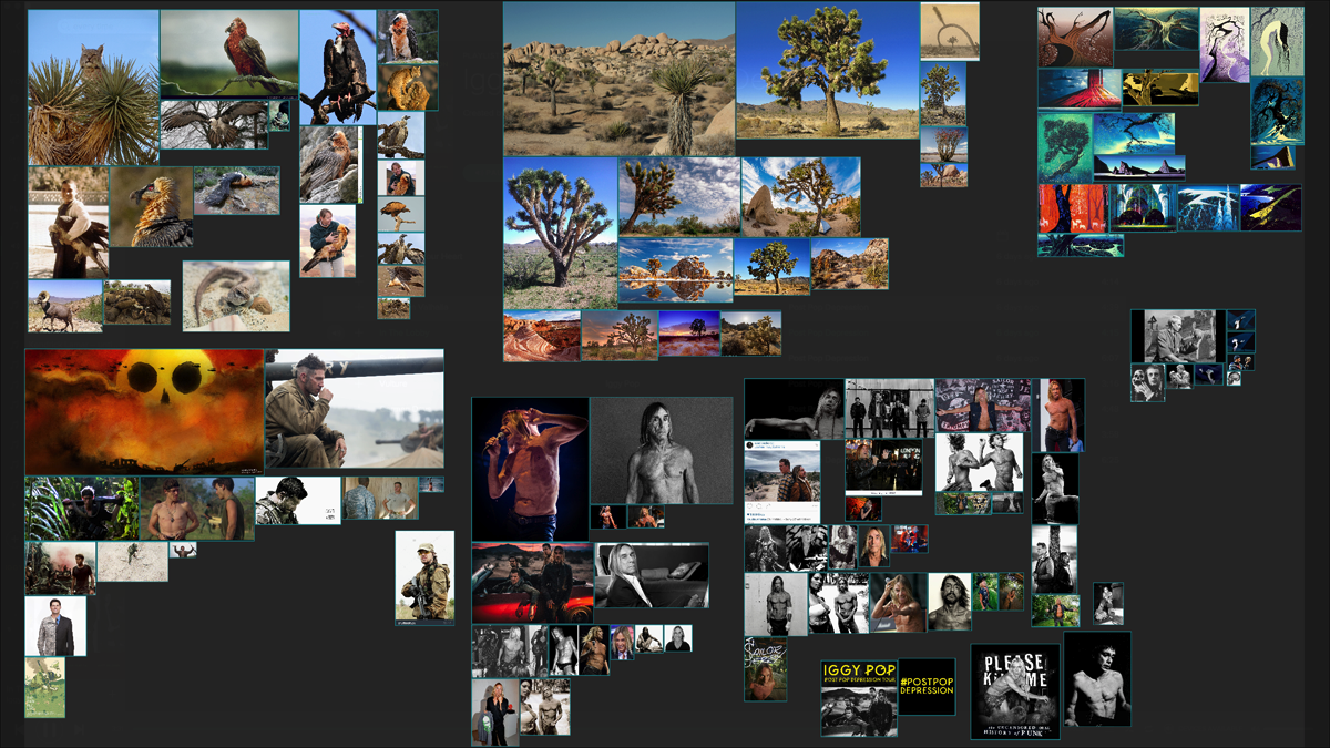
I was able to get a good amount of rudimentary background information by simply writing down associated words and Googling around to begin a mental mood board, but after the album came out, research material poured in (mainly in the form of full-length podcast discussions and live performance reviews) and I was able to get a good fix on the vibe of the release.
Recorded in secret around the Southwestern American desert, the music channels the spirit of Pop's good friend and recently departed partner-in-crime David Bowie, who (aside from producing some of Pop's indisputably best-regarded solo albums) helped wean him off of hard drugs during the 70's. As a result, Pop's lyrics possess a haunting brand of depth that is unique to these sessions, framed by the stringed decadence of one Joshua Homme, with fellow Queens Of The Stone Age member Dean Fertita on bass as well as Matt Helders of The Arctic Monkeys providing drums. The overall package is a cathartic ball of tightly-tuned and contradictory impulses, capturing (as the NY Times reported) 'the essence of an unruly life force battling the inevitability of decline and death.' Arrestingly emotive and "of its time," but how to sum it up in one image?
PureRef asset board with relevant research images and assorted references.
Brainstorm & Ideation
I've shot my gun, I've used my knife
This hasn't been an easy life
I'm hoping for American Valhalla
But if I have outlived my use
Please drink
My juice
-Iggy Pop (American Valhalla)
Attracted to the heaviness of this topic, I searched for a song that could be taken as emblematic of this theme, sketching intermittently as I brainstormed, allowing the music to wash over me while trying to remain open to whatever connections would present themselves as I was taking in Pop's vision. I found what I was looking for in the song "American Valhalla," in which Iggy inhabits the character of a veteran pondering the meaning of an ambiguous legacy at a life near its end.
I eventually got some loose thumbnails out before hunkering down and getting some tighter digital comps together. I liked the first for its fluidity and the possibilities for motion and space I was feeling out. A common criticism of many poster artists (particularly illustrators and especially figuratively-focused ones) is our inability to innovate or deal with typography, so I made sure to come up with some sort of connective visual gimmick to tie things together.
The second one took the premise of the first, but imbues touches of influence from films (Apocalypse Now, No Country For Old Men, Predator) and videogames (Call Of Duty, Metal Gear Solid) while strengthening the core pose, channeling stateliness as opposed to precariousness. Following that feeling, I adjusted pictorial elements to align in a more grid-like fashion, focusing on designing for more space between the visual notes rather than a less-organized "free-for-all," of detail which I feel I'm associated with. The second just felt stronger and more appropriately inspired by the song, so I proceeded with this sketch as the skeleton of the full composition.
Drawing / Traditional Illustration
"This is the key thing that has always been misunderstood about me.
All this fucking crap they said I did ...
I only did it because I believed I was playing the actual music that was appropriate and good to reflect that time and place. ... Frankly, I've always felt I was completely innocent."
-Iggy Pop
Once the concept was set and the sketch completed and approved, I set about polishing the idea into a tighter visual rendering. To do this, I took the digital sketch, enlarged and printed it out so it would fit on 14"x17" bristol (cutting and stitching together several 8.5"x11" pieces of paper since I own a small printer) and took it to my light table for tracing. I had some difficulty getting Pop's face right at first, so I had to work some Photoshop magic and reprint the reference to perfect the likeness in order to get the poster looking right.


The first pass was done in Col-Erase coloured pencils, which do exactly what their name implies. The first pass was gestural, about finding balance between the free-flowing anarchy of the printed-out digital preview and my own traditional hand-drawing. Though it could be viewed as an atavistic attitude, I don't mind taking these extra steps to imbue that "traditional touch," into my work. I love the organic quality of "real," materials, and I think their use comes across in the final product to a trained eye.
The second pass was done in mid-toned graphite to differentiate it from the first one. The tone of the graphite means it is of medium-strength (instead of very hard for low-value light, or very soft for high-value dark), which allows for slightly more accuracy and rendering detail than the softer coloured pencils. The final pass was done in India ink using a Pentel brush pen and assorted Rapidograph technical pens.
After the base drawing was done, a sheet of translucent vellum was taped over it in order to draw a secondary layer. This is good for testing details without messing up the main piece, and it affords a bit of flexibility when placing the pieces. Handy for layering.
Digital Processing / Composition
"You say I look goofy? OK, great.
You say it's comedy? Great.
Whatever anyone thought, I didn't care.
Could be goony, could be sexy, could be stupid, could be cool.
I didn't know, but as long as it was something, you know?"
-Iggy Pop
Once the pieces were illustrated, the time came to scan and combine everything and begin colouring. After some rudimentary clean-up in Photoshop (Dodging unwanted greys, Burning spotty darks, manually drawing in frayed lines, etc.), the keylines were Bitmapped (pixels made black or white) and imported onto separate layers. Once the black-and-white composition was cemented, midtones were digital drawn in as the the image was divided into portions (archived in the Channels window) using a combination of Flatting plugins, Quick Masks, and Pen Paths. All areas were separated and shaded, grouped into Channel names such as "Animals," "Plants," "Earth," "Wind," "Figure," and "Type." Each of these categories were subdivided further into more specific partitions and shaded as I went along. I improvised the light source as slightly in front and to the left of Pop's figure (like a dusk sun setting in the West) and toned accordingly.


Somewhere in that mess, I decided to try doing hand-drawn type for the logo/header. However, I realized in the midst of it that I could probably find a better way of doing it since I really wanted the title to "pop," and provide additional reinforcement to the overall concept of the poster. Realizing this, I refreshed myself on the basics of digital type implementation with fellow music-industry-worker-bee Brandon Rike's Skillshare Class (Lettering Made Simple: Efficient Methods for Custom Type) and took some time searching for The Right Font. It took an afternoon of browsing, but I eventually found one that had the same general weight as my sketch. TT Firs is a Scandinavian-influenced font with a lean, classical vibe, which was an absolutely perfect title case for Iggy Pop's American Valhalla. So I dropped some money and purchased a few weights, eventually tweaking one to a visual balance of my liking before integrating it into the grid of the poster. The footer text containing supplementary tour info in hand-drawn psychedelic type was added later on.
Full Bitmapped composition without shading or colour.
Full composition with coloured tones, and type previews inlaid.
Once the composition was separated (into object categories and keyline/fill groups in Channels) I just dove into the illustration and rendered like hell. This part is exceptionally fun because much of the complicated thinking is done and I can think in simpler terms, focusing on creating local colours, qualities of light, and textures until the whole thing hums. I have fewer notes on this part of the process because it's less thought than action at this point.
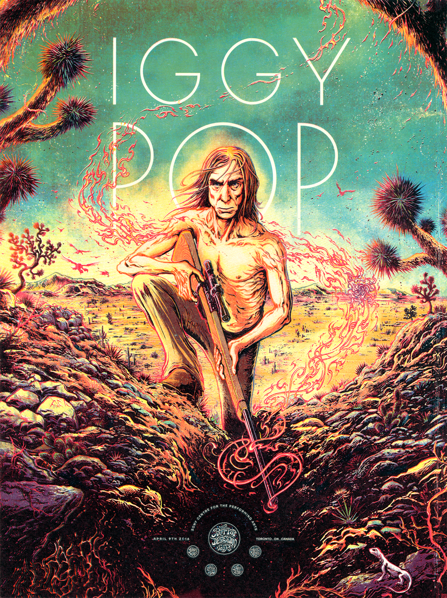
Final full digital illustration.
Screen-Printing
"They say that death kills you, but death doesn't kill you.
Boredom and indifference kill you."
-Iggy Pop
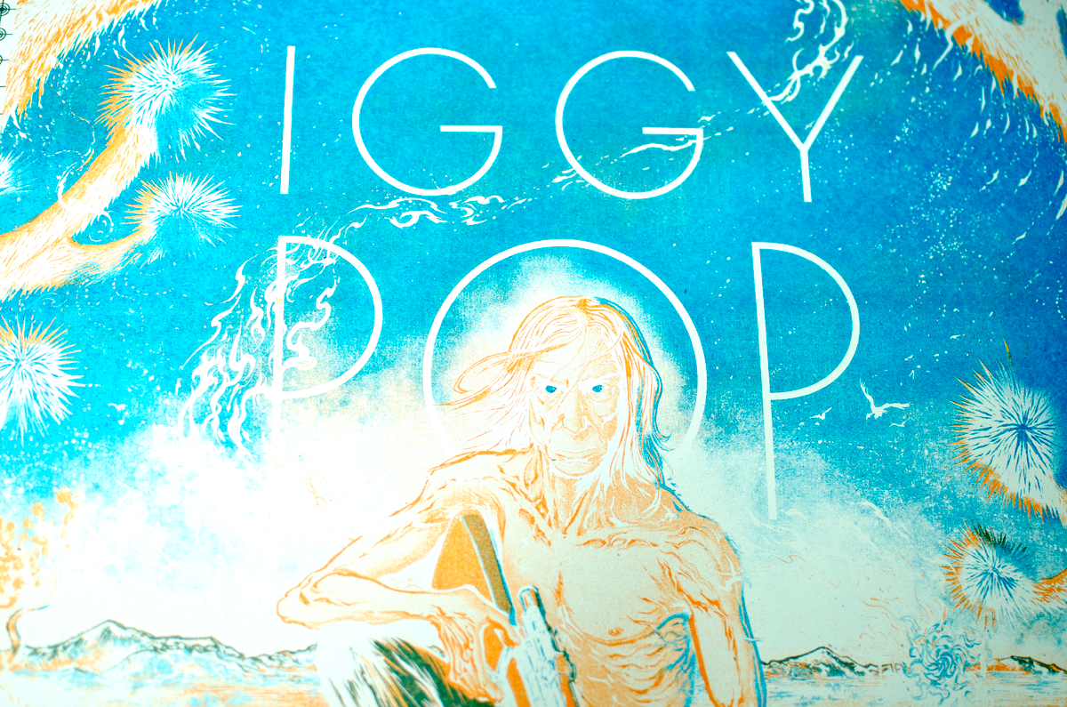
Manufacturing went smoothly, with only a few on-press hiccups that necessitated the DIY improvising that us printers know and love these physical processes for. Layer order went Orange, Cyan, Magenta, Yellow, and then Key, with a Glow-In-The-Dark varnish for unity. Since setup occurred thenight before, printing only took a single (full) day's work.
Details
"What some people would call antics, I would just call a good show."
-Iggy Pop
Final scan of the screen-printed gigposter.
This poster will be on sale soon, so make sure you're on the mailing list to catch the email alert before the product drop goes live. Thank you so much for your time and attention!


