Concept
"We are part of this universe;
we are in this universe,
but perhaps more important than both of those facts,
is that the universe is in us."
Neil DeGrasse Tyson is an American astrophysicist, cosmologist, author, and science communicator. A highly-respected associate in his fields of research, Tyson's broad interests include star formation, exploding stars, dwarf galaxies, and the structure of our Milky Way. He has held positions in various prestigious organizations such as Princeton University, the American Museum of Natural History, the NASA Advisory Council, and the Hayden Planetarium in New York, writing 10 books (such as The Sky is Not the Limit: Adventures of an Urban Astrophysicist and Death By Black Hole) in the process.
Tyson engages with the public regularly as an essayist for dozens of science-related periodicals, through his (amazingly nerdy) Twitter account, Ask-Me-Anythings on Reddit (in which he is responsible for 3 of the most popular AMA's of all time), and giving keynote speeches and lectures across the country advocating cosmological discussion and critical thought. He has also been involved in numerous televised interviews (on programs such as The Colbert Report, The Daily Show, Late Night With Jimmy Fallon, and Real Time with Bill Maher) and served as host for the educational science television show NOVA ScienceNow on PBS from 2006-2011.
Since 2009, he has also hosted a weekly podcast called StarTalk, in which comedians and celebrities are enlisted as guest speakers to help bridge the divide between science and pop culture (Tyson has also guested on numerous other podcasts such as Radiolab, The Skeptics' Guide To The Universe, and The Joe Rogan Experience). Most recently, in 2014, Tyson has hosted Cosmos: A Spacetime Odyssey, a reboot of the beloved original show (the most widely-watched series in the history of American public television), a position previously occupied by legendary astrophysicist, science popularizer, and personal mentor, Carl Sagan.
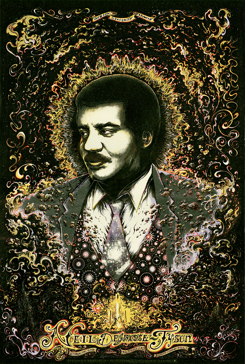
The man works tirelessly to make science and rational thought accessible to audiences of all ages, genders, nationalities, and professions through humour, relevance, and reverence, and is one of the most prolific and visible figures on the edge of America's intellectual frontier. So, needless to say, it was indescribably intimidating but incredibly exciting to be chosen to do some commemorative screen-printed posters celebrating his sold out lecture in Baltimore, MD in October of 2015.
Brainstorm / Ideation / Research
"I claim that space is part of our culture.
You've heard complaints that nobody knows the names of the astronauts,
that nobody gets excited about launches,
that nobody cares anymore except people in the industry.
I don't believe that for a minute."
This assignment was a little bit different compared to my typical subject matter, which usually span animals, bands, instrumentalists, monsters, and singers in a concert setting defined by a tangential personal connection or reference, the current state of the artist's brand vibe (with psychedelic accents), not lecturers or science communicators. Despite this, it's easy for one to recognize that Mr. Tyson is something of a rockstar in the scientific community, so I resolved to treat this job as I would one involving any other rocker or rapper.

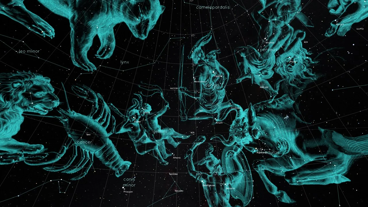


I began by conducting some elementary Internet research in order to form a visually-assisted vibe of the subject at hand, taking in some of his talks and random episodes of the aformentioned shows he has guested on or hosted. Since the man is a contemporary science speaker who has been at this for many years, there was an almost overwhelming bounty of material to sift through.
After taking some notes and doing some small, light sketching, the solution began to reveal itself. Neil would need to be front row center since it was his event (and all he does is talk; no elaborate branding or stage show stuff, as with some performers), and I needed to work some artistic or science-related details into the composition.
Drawing / Traditional Composite
"Passion is what gets you through the hardest times
that might otherwise make strong men weak,
or make you give up."
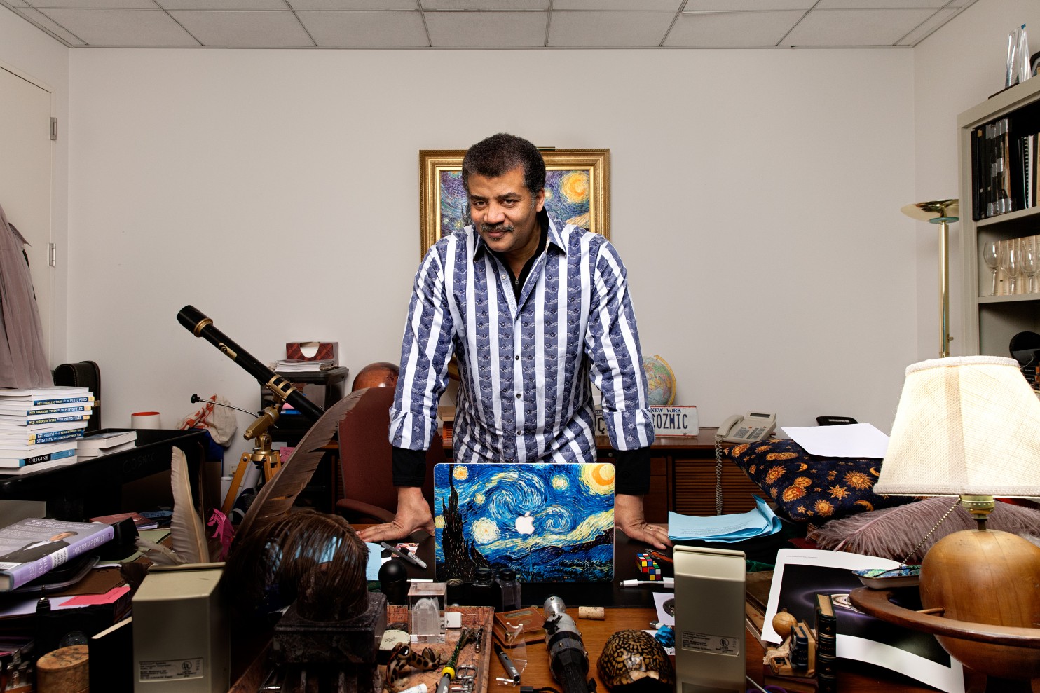
Once the direction was settled and the research and assets were organized, I set to work. I treated the composition somewhat like a movie poster, since his talks are legendarily epic and mind-blowing and I wanted to relay that humbling grandiosity. The collage skeleton was formed out of a promo photo of Neil, the Cosmos title sequence background (which looks a lot like an iris to me), a NASA rocket lifting off (representative of his role in the organization and a metaphor for his thesis of the profundity and importance of discovery), and pieces of Van Gogh's Starry Night (which is his favourite painting and a nice connection to my own affinity for art, history, and wonderment).


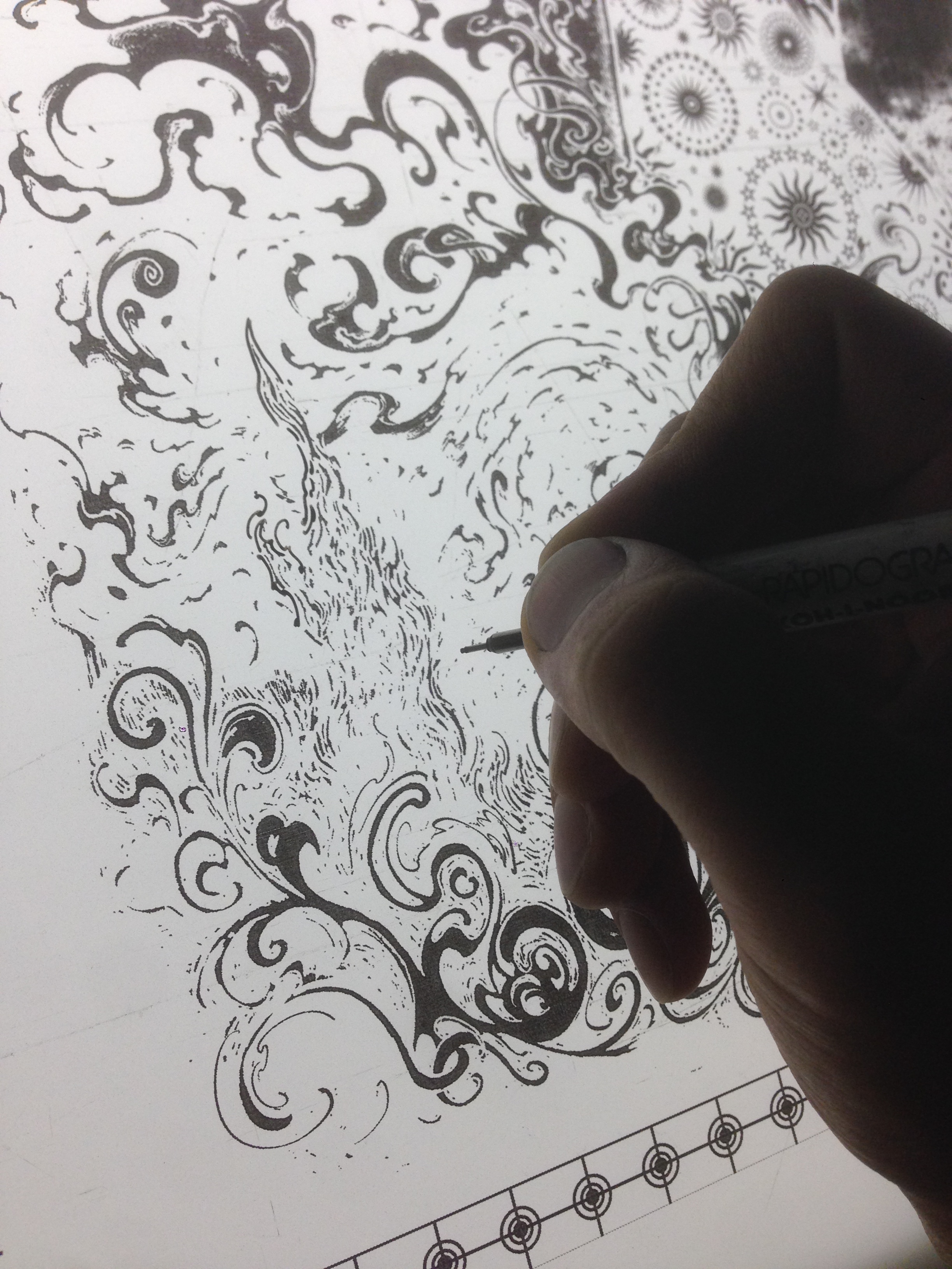
Once the collage was completed, it was enlarged to the same size as the eventual poster. I stitched letter-sized sheets together to form a large tracing template and worked on the drawing on medium-thick smooth Bristol plate at a 1:1 ratio in order to maintain detail and to try out rendering using both graphite in addition to the usual ink. I wanted to up the realism on the rendering, which would have been harder to delineate using just inks. Pencils allow for more softness and subtlety, since the ability to erase and shade allows for much more push and pull.


I don't remember exactly how long the drawing took. After the rough lines and shapes were drawn, the large reference-trace image was removed from beneath the Bristol and used to adorn the walls of my home studio. It's always helpful to have reference images in easily-viewed areas around the workspace when doing illustration work, especially if you don't draw the same thing over and over again (which my job usually necessitates). I took inspiration from currency etchings, various portrait shots of Neil, and scientifically-oriented imagery like asteroid belts and galaxies.
I really wanted the rendering to match up with the fierce dignity (and enormity) of Mr. Tyson's message, so I took my time making this large drawing very tight and detailed, making efforts to adorn the realistic anchor of the character with an eye-catching blend of abstraction and rhythm.


Colour-adjusted final ink and pencil drawing. I like how it feels as though he is ripping the universe a new asshole with the force of his intellect.
Digital Processing
"The methods and tools of science perennially breach barriers, granting me confidence that our epic march of insight into the operations of nature will continue without end."
Once the traditionally-drawn foundation was cemented, the time came to dress it up in the filigree of digitally-laid colours. I started by upping the contrast of the original rendering and laying in midtones to indicate value, encompass space, and suggest light.
Once the keyline art and midtones were created, colouring flats were laid in. I also took time to create patterns inspired by Neil's famous collection of vests to create visual interest and unify the bottom half of the composition.


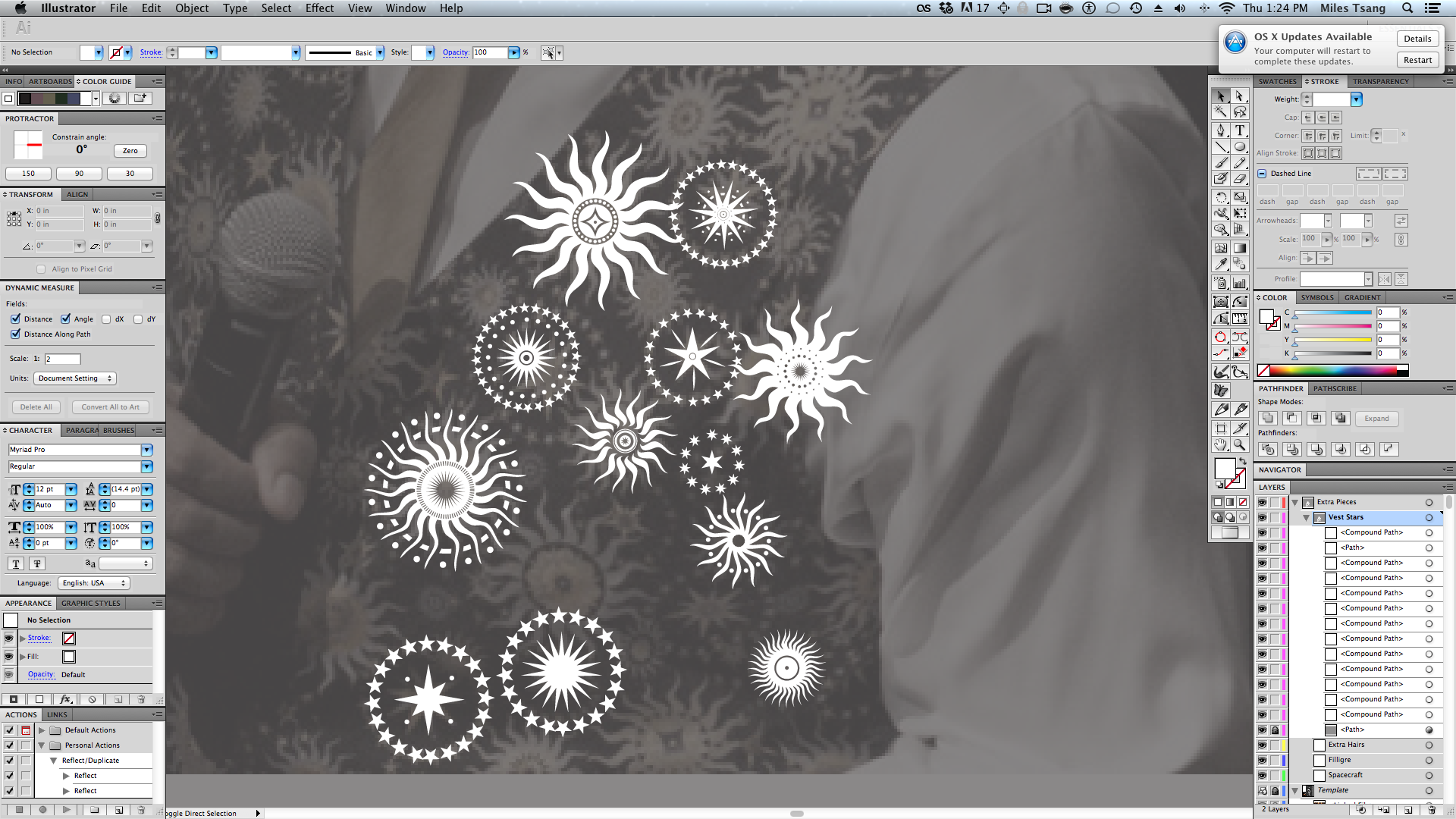
The stars patterns were drawn in Adobe Illustrator and then further textured in Photoshop.
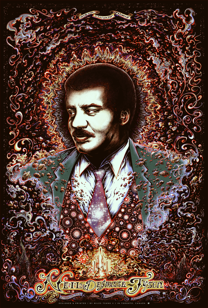
Once lines, flats, tones, textures, and patterns were all thrown into the composition, the time came to organize layers and then just render like hell. The poster went through many "looks," and iterations before a final CMYK-layered image was finalized.


Final digital preview. The eventual printed image would end up looking quite different, however.


Screen-Printing
"I think the greatest of people in society carved niches that represented the unique expression of their combinations of talents,
and if everyone had the luxury of expressing the unique combinations of talents in this world,
our society would be transformed overnight."
The printing process went by relatively smoothly, although there were some unexpected fixes that needed to happen towards the end of the run.
Exposing the large screens (sized to fit the semi-automatic press) went down without a hitch.
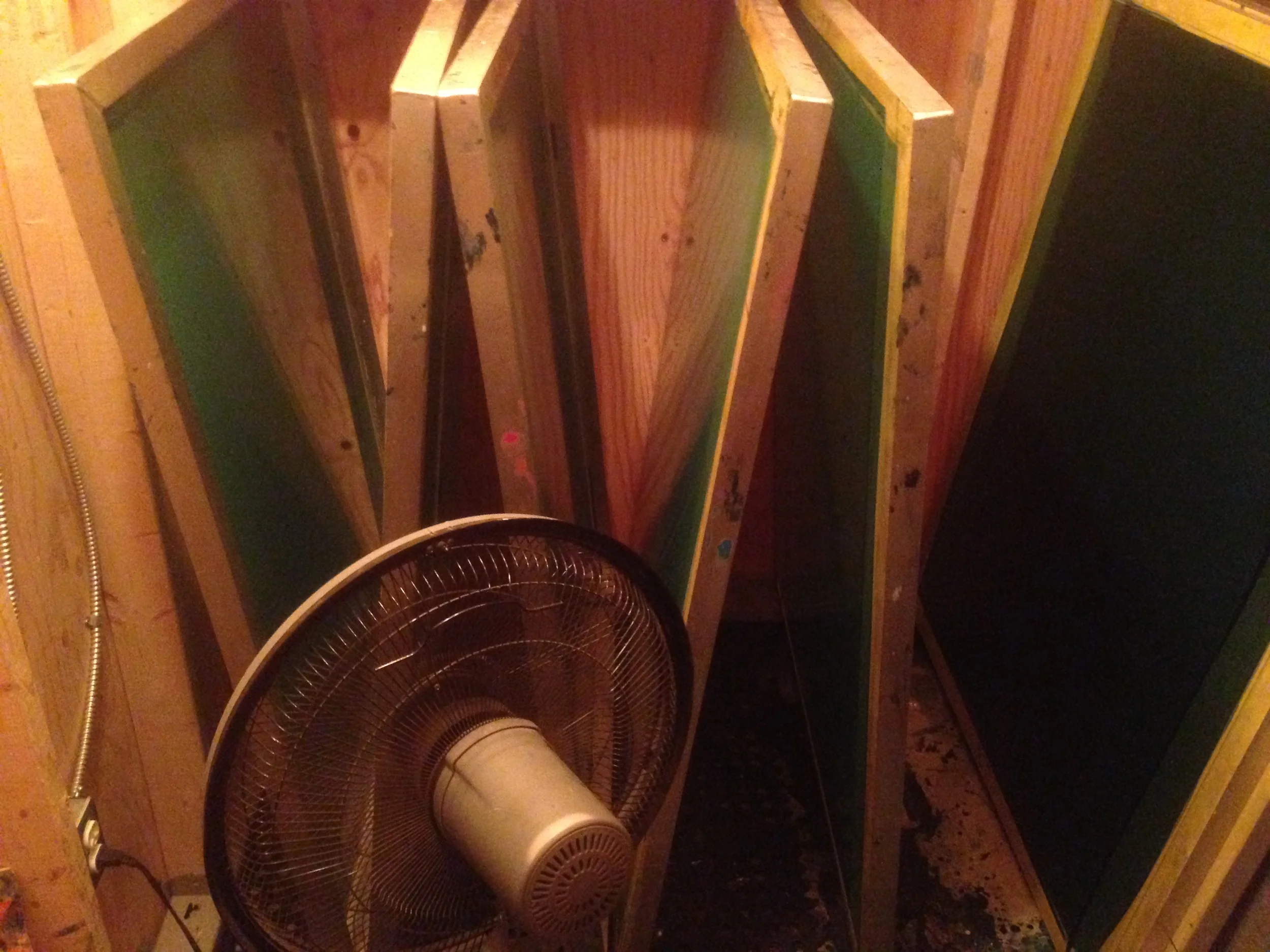
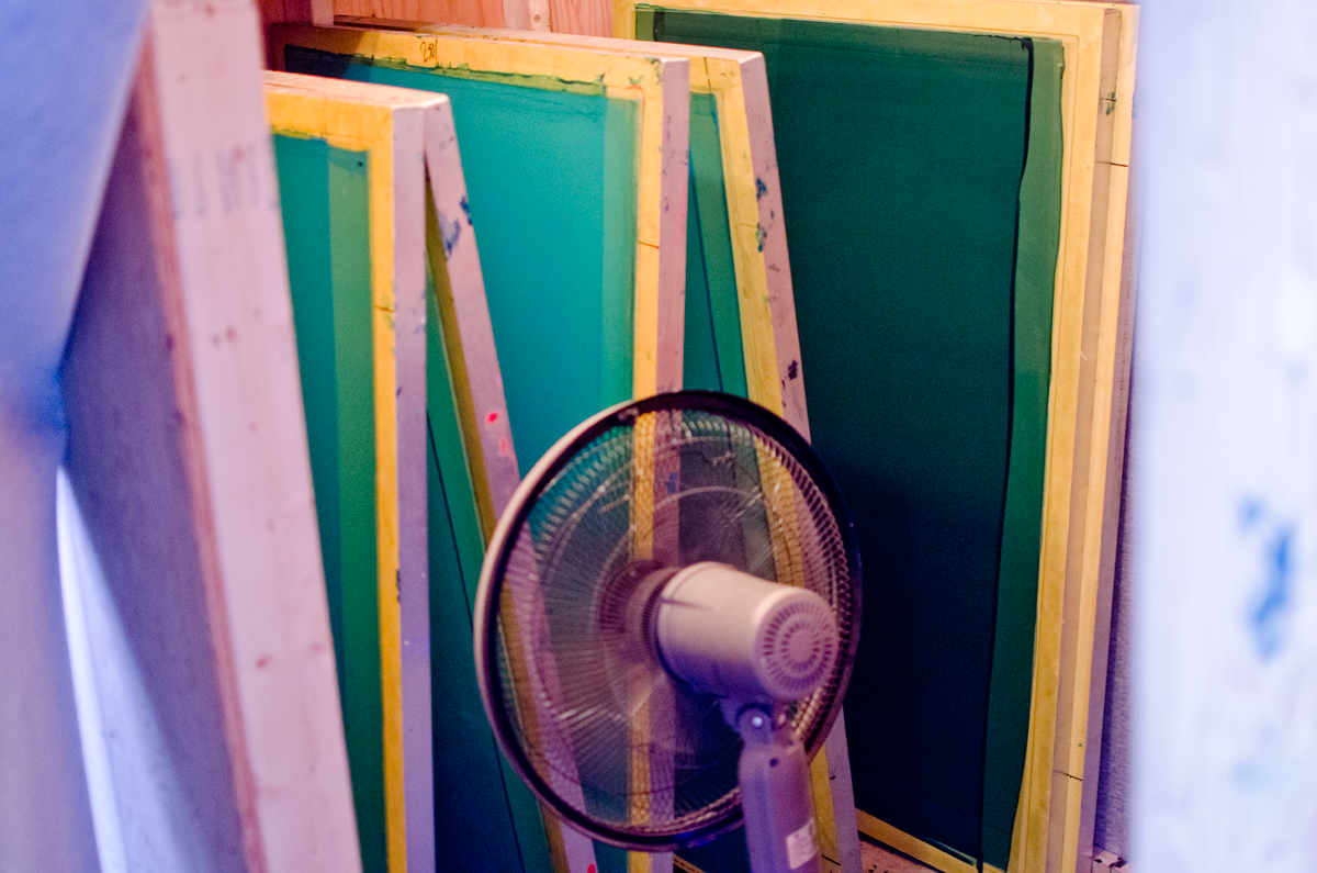


A hitch occurred when the time came to print the key. I didn't factor in the enormity of the black keyline which included both the exterior black of outer space and the pencilled textures of the midtone. The layer was large but also needed to be very solid, so the run needed to be hit twice in order to maintain the proper (prioritized) opacity.
Because of the high-density key, I decided to hit the poster with another glow layer in order to bring up more medium tones (hitting the poster twice keyed up the contrast a little too high for my liking).


Hand-drawing extra lines on the computer-generated films. Because I can.
Laying down the supplementary glow layer to lighten the final posters.


Once all the layers were printed, the posters were given a few hours to touch-dry and were then pressed for flatness (sometimes uneven ink distribution can warp the paper and make trimming annoying).
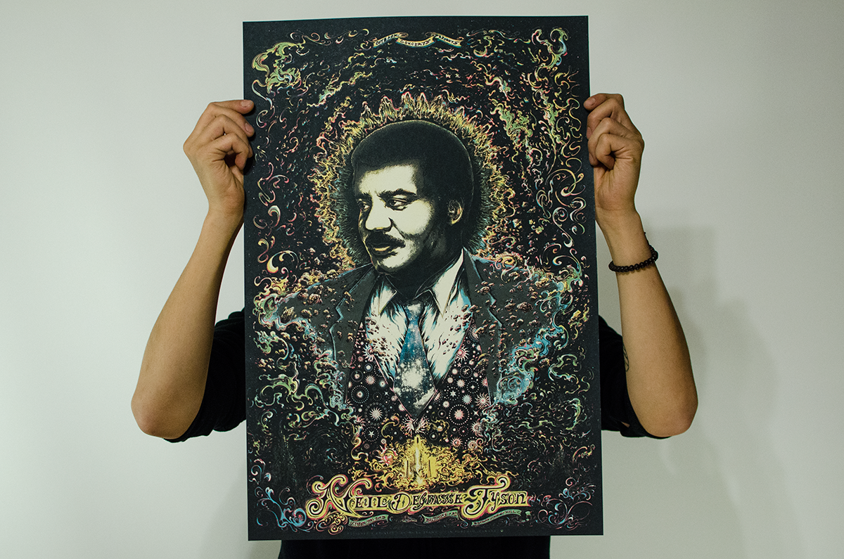
The final posters came out beautifully. Once pressed for flatness, trimmed and officiated with signing and numbering, and misprints removed from the edition after quality-control, the posters were promptly packaged and sent across the border, eventually landing at the venue Meyerhoff Symphony Hall.


Products / "Gigposters"
"People generally don't recognize how long it takes to conceive, publish, and write a book."

