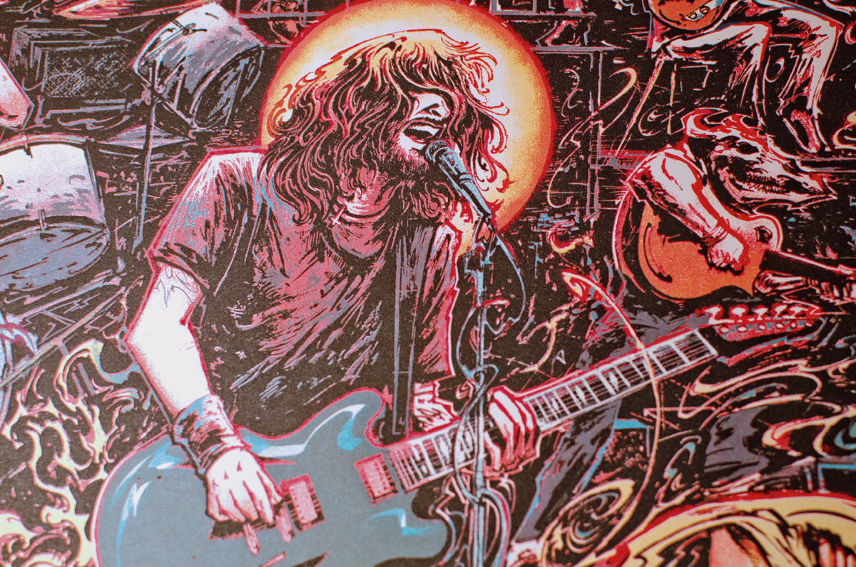
Foo Fighters are an American rock band formed in Seattle, Washington D.C. Arising from the alternative rock boom of the 90's, the group was born of the early recordings of frontman Dave Grohl and has released 8 records, earning several Grammys and millions of album sales in the process. When I started out, I never thought I'd be getting paid to do work for these guys. They are one of the most popular rock acts on the planet, and knowing that I'd been hired to do merch for their two-night stint in my hometown of Toronto was a very surreal thing.
Concept
“I think there’s something about a city that influences the way people play music in that city.”
The Foo Fighters have released numerous great albums over the years that allow for some very exciting and open interpretations, though the most recent one (Sonic Highways) came with a very distinct concept.


Each song off of this eighth record was recorded in one of eight different cities and studios. The band traveled across the United States, engaging musicians, recording engineers, producers, and other figures associated with the industry in conversations about the country's musical history. Lyrical inspiration and sonic directions for songwriting were derived from sound bites, interviews, as well as the atmosphere and conditions of each studio and corresponding city.


It felt silly to not make use of this direction, so I watched the show and listened to the album to get into the mood while building a file of references, screencaps, and searches. There were too many interesting details to reference and connections to make. It was a bit overwhelming by the time I'd digested everything.
The series profiled artists like: Gary Clark, Jr. Joan Jett,Trombone Shorty, Ian McKaye, Public Enemy, Zac Brown, and Willie Nelson to name a few. As sometimes is often the case, I didn't really know where to start. I just knew I wanted to draw them all (which was bad, as other projects had left me with only a week to design and execute before printing, with no days to spare before the show...).
Sketch / Collage
"Give me something to assemble,
I won't look at the directions, I'll try to figure it out by myself.
It's why I love Ikea furniture."
Once I decided to go the complicated route and find a way to illustrate this assortment of figures from Sonic Highways, I was able to sharpen my focus into a problem needing solving. How to jam this many people into a composition while building upon the concept of the album, series, and tour? I went through a period of note-taking and thumbnailing before I started to make visual connections.
Things started to come together when I recalled this crazy surprise concert in which Kendrick Lamar rapped To Pimp A Butterfly while riding on the back of a truck-drawn stage. This gave me the idea to put the band on a float roving through the streets of the city, with concert-goers crowding the scene like a great, shimmering river surrounding a booming raft. The idea was fleshed out with more reference photos of various stage light setups and truss configurations. I also noted that there would be people hanging off of shit because I'd recently seen the new Mad Max movie and it rocked quite hard.
Eventually I realized I could drop this setup into a Canadian locale, settling on having Sam The Record Man be the backdrop. I used it because I felt the choice was line with the spirit of Sonic Highways' themes (the unifying nature and historical importance of music and its preservation), as well as a strong symbol of the changing mores of the industry. There aren't many immediately iconic Canadian music-related structures that come to mind quickly, but the solid shapes and historical significance of Sam The Record Man stuck with me and felt like the perfect choice in this context.


Once the concept was settled, I searched for some pieces to use as reference points. I wasn't out to copy their exact layouts, but I needed to figure out how all these characters were going to act within the space. I needed to figure out how crowded the foreground would be, how much dimensionality and perspective to try for, all while keeping typography in mind.
After taking in the assets, building research and connections, concocting a concept, deducing specifics in content, and trying to get a handle on the form, I was able to make headway on actually executing this baby behemoth. I decided to go flat because I'm not great at perspective drawing, and I wasn't confident in my ability to create a diptych under a deadline with this much weight and pressure. Going full profile seemed like a good way to schematize the layout and suggest a proper pathway. I ended up using that as the skeleton and created a strong layout sketch in Photoshop to get everything straight in my head. I knew I wanted a design that built off the two Sam The Record Man signs, with circular motifs and cyclical suggestions littered about.
A reference collage was Frankenstein'd using pieces from the research phase in Photoshop, combined with some elements of the stage that were developed separately in Illustrator. Looking at references of the Toronto Pride Parade and various concerts helped visualize the scene as I went.
It took a while to get going, but the float eventually took shape. Somewhere along the way, I stopped caring about how apparent it was that this was a float. You'll either get it by deducing background details and interpreting it as such or you won't. After a while of messing with the placement of all these pieces, I stopped caring as much about the concept than making all the figures work in harmony on stage with one another.
Figures and details were transformed and moved until the balance felt right. After the placement of the figures was mostly settled, I started adding supplementary accessories and "trails," to suggest paths and areas of interest to draw the eye.
The collage took a few days to complete but was essential for maintaining, balance, detail, and structure. Assembling this provided the necessary blueprint for finishing this illustration within the second half of the week (Record Time).
Traditional Drawing
"Because you have things like 'American Idol' and you've got radio stations that play music made entirely by computers, it's easy to forget there are bands with actual people playing actual instruments that rock."
Once the collage was finalized, it was printed as 4 sheets of common thin copy paper and carefully placed atop the maximum allowable live area (with a quarter inch spared on the horizontal edges), sandwiching Saral transfer paper onto 16"x20" clayboard. A ballpoint pen was then used to trace all the rough forms onto the board.
Once the rough lines were laid down, they were lightened with a kneaded eraser and detailed further in graphite, using (offscreen) reference photography, intermediate knowledge of anatomy, spatial common sense, and my own instinct.
Some areas required heavier editing, or needed to have the figures changed out entirely, despite all the preparation of the collage stage. I used my trusty vertical projector to make these corrections quickly (I couldn't use a light table since this illustration was being worked on clayboard for its eventual editability).
After this came an afternoon of speedy rendering. Using rulers where necessary, but mostly freehanding all the forms and figures, balancing the shapes of their bodies against the detail in their silhouettes. The stage-float began to take form here as well.
Side note: I wasn't even sure this gig was going to happen for a hot minute because the band cancelled European gigs under the doctor's orders right around when I started the project. For a good few days, I was doing all of this at breakneck speed, not actually knowing if the set would see release.
Had I known that the tour would eventually be rebranded "The Broken Leg Tour," I'd have slapped that on Dave's guitar right here, or drawn the throne of guitars, or at least his cast, but I wasn't notified of the change until a few days before the show itself. I'd have incorporated that here if I'd known. #irked
The illustration always became a blend of improvised details and guided lines, arranged with digital aid, but expressed through a physical human hand.
Going over the graphite under-drawings with solid black India ink.
Filling in patches and shapes using a combination of small (ruined) brushes and (well-kept) technical pens. Also starting to play with the clayboard surface by scratching away parts of the background to suggest delineation and movement.
Attacking larger areas first, dripping and chiseling away until the proper shapes present themselves for finer detailing. Very haphazard way of working.
Final unaltered clayboard drawing with midtones and keylines..
Final traditional drawing with heightened contrast, scanned and ready for coloration.
Digital Illustration
"Some people record onto tape, and then they pay for the tape, and download those onto a hard drive. Initially in a Pro Tools program. Other people go straight into digital, and use no tape at all."
Starting by separating the dark keylines, midtones, and white/negative space. Shading them with different tones so they're easier to differentiate. I prefer starting with a red base for some reason.
Dropping in flats, separating Channels and Masks, piece by piece, figure by figure, and object by object.
Further establishing paths, consolidating some of the flats, and adding textures to the larger objects and pieces in the scene. Once each piece and person is separated and sorted, applying tones to the separated black, midtone, and white layers becomes more algorithmic.
Focusing on colour vibration and additive mixing. Deepening chroma relationships to add contrast and modelling to the characters one by one. Tonal and chroma values were juggled for two days until the deadline forced the diptych's finalization.
First night in Toronto (July 8th, 2015).
Second date (July 9th, 2015).
Final digital preview.
Screen-Printing
"It's a weird thing when you make records.
You try to hear it before you make it, so you walk into the studio with this idea of what you expect to happen.
And that usually changes. That usually turns into something else.
And that's a good thing."
The tight deadline exacerbated the less-than-stellar printing conditions. It was humid like a hockey player's jock so there was fear of the paper swelling. Ink went down well and the diffusion in the dropout of the under-key helped.
Lining things up with the acetate-taped-to-the-table method.
Yellow layer going down (it dries a little more transparent).
Someone hook me up with a wholesale deal with Speedball. I use so much glow in the dark ink.
Full untrimmed stacks of posters.
Finalized untrimmemd sracks of posters.
The posters were then checked, editioned (signed and numbered)


Physical Products / Screenprints
"At 13 years old, I realized I could start my own band. I could write my own song, I could record my own record. I could start my own label. I could release my own record. I could book my own shows. I could write and publish my own fanzine. I could silk-screen my own T-shirt. I could do this all myself."
- Process.
- 18" by 24"
- 5-Colour Screen print on French Paper (100 lb. Speckletone True White)
- Editions of 325. All posters glow in the dark.
- Printed, numbered, and signed by the artist.
- Commissioned as part of Foo Fighters' Sonic Highways 2015 World Tour.
- All transactions are in $USD.
- On sale at a random time on Saturday, July 11th, 2015.
- Limit of one copy of each date per household
- Please subscribe to the mailing list/newsletter for info on new releases.
Thank you for your time and attention. / These posters have sold out.
{ Please sign up for the newsletter below to be alerted before new products/sales go live.
Thank you. }


![Foo Fighters - 2015.07.[08+09]. / Molson Canadian Amphitheatre / Toronto, ON.](https://images.squarespace-cdn.com/content/v1/5532bf6fe4b0c604b973cf8c/1436519634694-N63ZSDHF9XYGYEBKOBDI/Foo-Fighters-July-8th%2B9th-Diptych_Final.png)