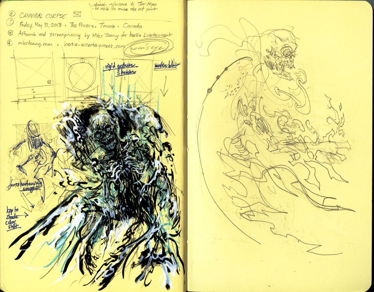
Cannibal Corpse are one of the most popular and enduring death metal acts to have graced the world stage. Their sound is extremely dark, mercilessly heavy, relentlessly technical and their lyrics are cartoonishly macabre and outlandlishly violent. Fresh from having done the smoothly-polished Patti Smith print, I was glad to take this assignment on as my next gig poster, and to seize the opportunity to create some heavily contrasting visuals. My goal for the image was to again flex techniques I toyed with for last year's Odd Future poster and as always, to catch, lock, and excite the eye.
Rough Drawings / Sketches
As always, I started gesturing loosely with a basic idea. With a band whose name is Cannibal Corpse, one needn't strain themselves over reinventing the wheel with some crazy high concept (although there is some Tar Man from Return of The Living Dead influence in there). These first sketches were done entirely in Photoshop and consequently abandoned when I found them too rigid in posture and too loose in marking. I wanted to describe guts and gore, and after getting these fun-but-failures out of my system, I knew I'd have an easier time with going at it old with traditional brushes, pens, and india inks.
More sketches, including the one to be taken further. I wanted to give a domineering, overwhelming sense to the image so I tried to exaggerate the figure's contorted posture, eventually faking a foreshortening effect with the legs to make it seem like he's almost stepping on the viewer's face.
I enlarged that sketch and used a light table to draw up a roughened semi-composite on a 17"x14" piece of bristol board. Some edits had to happen in Photoshop as this semi-comp was also done very loosely because I was saving my rendering efforts for the next step.
Refined Drawing / Semi-Composite
Next, I enlarged the second drawing to about 25"x19" and transferred it to hot press illustration board. I dimmed the image's opacity by applying a few layers of watered-down gesso so I could essentially see the under-drawing clearly while being able to blow it out in Photoshop very easily. Spent a couple of days just rendering the cannibal corpse and getting lots of lyrical licks and intestinal globs going.
Final Composite
After the key was established, I took it into Photoshop and started playing with splattery brushes, layer masks, and explosive colours. I used sampled brushes from CGTextures and made a few halftone ones as well.
I eventually decided I'd be using Parchtone Relic Gold French Paper to give the drawing a warm, creamy glow. More textures and few reddening touches to the palette later and we've arrived at the standalone "art print" image.
I took that into Illustrator and played with different type configurations. I didn't do any planning on the type's composition; I just sort of winged it, eventually deciding on a vertical layout similar to the one I used for Death Grips. I took care to establish a hierarchy of importance through use of font colour and size, and later on, surrounding glows and textures.
The finalized image, complete with halftones, ready for separation and printing.
Screen-Printing
The three layers, in order of appearance from left to right.
A physical transparency printed on vellum.
My beloved workspace, with Parchtone paper laid out and the first screen set up.
The second red layer set up, after the run was printed.
Prints drying. Registration was harder on this job because the first layer is so large, the paper sucked up a lot of ink, causing some curling and probably some expansion as well.
A close-up of the print with the second layer laid down.
The finalized untrimmed print with registration marks still attached.
Details
Thanks so much for reading this post! These prints are available now through The Shop.


