Overview
This is Oderus Urungus, lead vocalist of the greatest sci-fi horror band Earth has ever seen. Get into it. Or be destroyed.
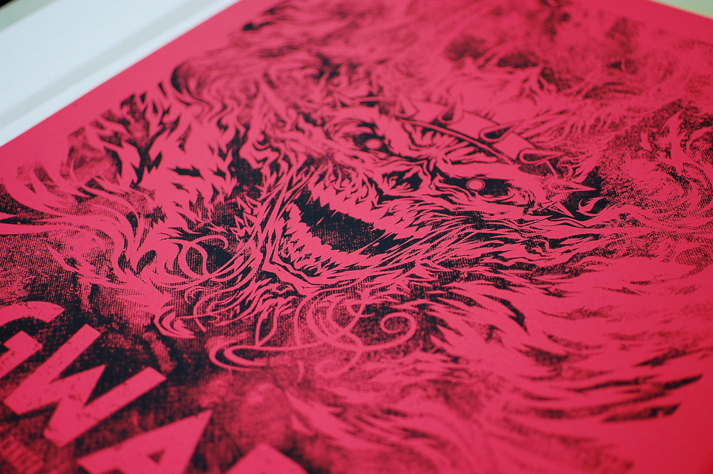
As of this writing, Gwar have been the prototypical boundary-pushing shock-rock act of America for 28 years, mixing the best parts of hard rock and thrash metal with wild antagonistic performances. They are an iconic band, and, having created an older poster for them years before I'd learned to print, I tried to keep the drawing for this poster very graphic. There is an emphasis on symmetry and texture, and an aim to be as direct as possible.
A sketch circa 2009 in ballpoint pen. I'd like my next poster for Gwar to be more along these lines.
Composite
Because I was juggling multiple projects at this time, I made an executive decision to dig into my archive and re-use an old line drawing that was screened in a tiny edition for class back when I was still learning to print. I used to work in an 11"x25" classic poster format...
...but have since switched to a 3:4 ratio. Thankfully, this gave the old design more room and effectively breathed new life into it.
I also added more flames in Illustrator for balance, as well as some messy half-toned textures in Photoshop to add more visual interest. As a result, this design took only a little over a day to process.
Headshot of the iconic Oderus.
Printing
[accordion] [accordion_item title="Gwar : Carry On My Wayward Son (Kansas Cover)"][/accordion_item] [/accordion]
One of the two transparencies on vellum.
The first layer of black ink applied. The second white layer is where the thicker shapes and most of the image's integrity lies, so that had to be second.
The second white layer about to be laid down.
Registered, flood, printed.
Prints drying.
Cut and sorted.
Arranged for dramatic effect, with a little cat for scale. For something that took a total of three days to design and print, I'd say this turned out nicely.
On sale now in The Shop. The blue edition is of 70 and the red is 25, for a cumulative total of 95. Thank you for reading!
*EDIT*This poster is now sold out.


